Photography Printing Guide: From Edit to Framed Wall Print
A print is the final exam your photo never takes on a screen. The honest…
Printing photos at home is worth it when you print often enough to use the ink before it dries — roughly a few times a month — and you value the instant feedback loop over the lowest per-print cost. The printer is the cheap part; pigment ink and quality paper are the real running cost. Get a calibrated screen, a pigment inkjet, and the right paper profiles in place and you can print, walk to the wall, adjust, and reprint inside half an hour.
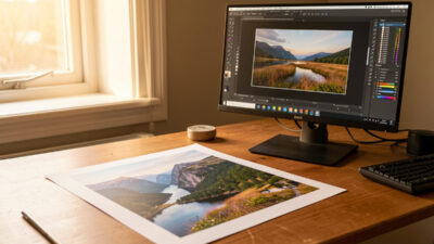
I print at home for everything I want to live with before committing — proofs, work prints, anything I will judge on the wall for a week. The instant iteration is the whole point: on a screen I am guessing, on paper I am looking. This guide is the actual home setup I run alongside both my systems, the costs nobody quotes you, and the handful of settings that separate a clean print from a muddy one. It is the hands-on companion to my broader photography printing guide.
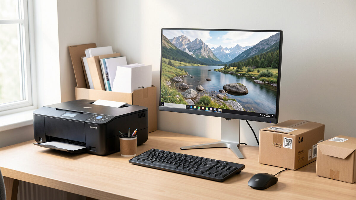
The home setup is four things, and only one of them is the printer. First, a calibrated monitor — without it you are editing blind and every print fights your screen. Second, a pigment inkjet printer, not a dye photo printer, because pigment holds color for decades and renders neutral black-and-white. Third, the correct paper and its matching ICC profile. Fourth, a daylight-balanced light to judge prints under, because warm room light lies about color and makes you correct toward the wrong neutral.
Notice what is not on that list: the latest camera. A clean, well-exposed 24-megapixel file prints a flawless 16×20, and my 40-megapixel files are overkill for anything I hang at home — the resolution buys me cropping room, not print quality. If you are still choosing a body, do not let printing drive that decision; my camera body buying guide covers what actually matters. For printing, spend on the screen, the printer, and the paper instead.
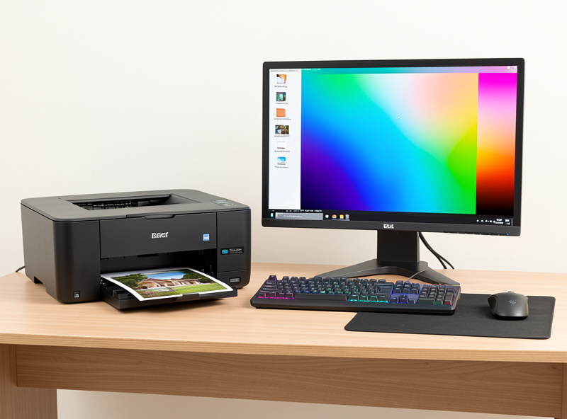
This is the one decision that quietly determines whether home printing is satisfying or frustrating. Dye inks dissolve into the paper, give punchy color cheaply, and dry fast — but they fade faster, are more prone to metamerism (color that shifts under different light), and never render neutral black-and-white well. Pigment inks sit as solid particles on the surface, resist fading for decades behind glass, and carry dedicated gray inks that keep monochrome prints neutral instead of drifting green in the shadows.
For photographs you care about, pigment is the answer, full stop. The trade-off is cost: pigment printers and their inks run more, and the machines are physically larger. But a dye print that fades in a few years on a windowsill is not a saving. If you are weighing specific machines, I break down current pigment models and the dye-versus-pigment math in detail in my best photo printers for 2026 guide. The short version: buy pigment, buy the right width for how big you actually hang, and budget for ink.
Here is the math nobody puts on the box. The printer price is a fraction of lifetime cost. A serious pigment machine carries a full set of ink cartridges or tanks, and a single quality sheet of fine art paper is not cheap. Add the ink each print lays down, and a 13×19 fine art print at home lands in real money once you account for everything — sometimes more than a lab would charge for the same print, sometimes less, depending entirely on how much you print.
The hidden killer is intermittent use. Pigment inkjets clog if they sit idle — the heads dry, and the cleaning cycles to recover them burn a startling amount of ink. If you print a few times a month, the machine stays healthy and the per-print cost is reasonable. If you print twice a year, you will spend more on head-cleaning cycles and wasted ink than a decade of lab orders would cost. Be honest about your volume before you buy. The table below is the trade-off I weigh every time, and the online services comparison covers the send-it-out alternative.
| Factor | Home printing | Send to a lab |
|---|---|---|
| Up-front cost | High (printer + full ink set) | None — per order |
| Per-print cost at volume | Low once the machine is busy | Flat per order |
| Idle-use penalty | Severe — clogs and cleaning waste | None |
| Feedback loop | Minutes — print, look, reprint | Days per round |
| Max size on a desk | 13-inch typical, 17-inch big | Any size |
| Color control | Total — your profile, your paper | High if you soft-proof to their profile |
Most muddy home prints come from one of three mistakes, and all are free to fix. The first is double color management — letting both the application and the printer driver convert color at the same time. Pick one: I let the application manage color using the paper’s ICC profile and set the driver to “no color adjustment,” or I let the printer manage and turn off application color management. Doing both produces a muddy, shifted print every time, and it is the single most common home-printing bug.
The second is skipping the soft-proof. Before I commit a sheet, I soft-proof the image against the exact paper profile on my calibrated screen, check the gamut warning for saturated colors that fall outside what the paper can hold, and pull them back gracefully. The third is output sharpening at the wrong amount — matte and cotton-rag papers need more sharpening than glossy because the ink spreads slightly into the fibers, and the right amount is always set at final print size. My Lightroom develop workflow walks through export and output sharpening in order, and the color profiles guide covers profiles and rendering intent in depth.
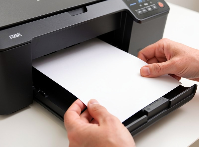
Buy a paper sampler before you commit to boxes. The same image on luster, matte, and cotton rag reads as three different pictures, and you cannot predict which suits a given photo from a screen. Luster is my workhorse for color — saturated, detailed, few reflections. Cotton-rag fine art suits portraits and landscapes I want to feel like objects, at the cost of shallower blacks. Glossy maximizes apparent sharpness but throws reflections and shows every fingerprint. If a piece is heading for a large living-room wall, I often skip paper entirely and go canvas; I compare the surfaces in canvas versus fine art printing.
Whatever you pick, match the profile to the paper. A glossy profile on matte paper prints sickly, and a generic “photo paper” profile on a specific fine art stock leaves color on the table. Download the maker’s ICC profile for your exact printer-and-paper pair, or have a custom one made if you use an unusual stock. Once a print is dry, let it “dry down” — inks settle and shift slightly over the first hours, especially on matte — before you judge it under daylight-balanced light. Then it is ready for the wall, which is its own craft covered in my mounting and framing guide.
Yes if you print a few times a month and value instant iteration. The printer is cheap; pigment ink and quality paper are the running cost. If you print only twice a year, idle clogging and cleaning waste make a lab cheaper and easier.
A pigment inkjet, not a dye photo printer. Pigment inks resist fading for decades and render neutral black-and-white with dedicated gray inks. Choose the print width for how large you actually hang: 13-inch suits most enthusiasts, 17-inch for bigger work.
Almost always double color management: both the app and the printer driver are converting color at once. Pick one. Let the application manage color with the paper ICC profile and set the driver to no color adjustment, then soft-proof before printing.
Far more than the printer price. Budget for a full set of pigment inks, quality paper per sheet, and the ink each print lays down. Intermittent use adds head-cleaning waste. At steady volume the per-print cost is reasonable; at low volume it is not.
Yes. An uncalibrated, too-bright screen is the number-one cause of bad prints because it makes you edit too dark. Calibrate with a hardware sensor and lower screen brightness toward print-viewing levels before you trust what you see.
A print is the final exam your photo never takes on a screen. The honest…
Leave a Reply