Printing Photos at Home: The Complete Setup Guide
Printing photos at home is worth it when you print often enough to use the…
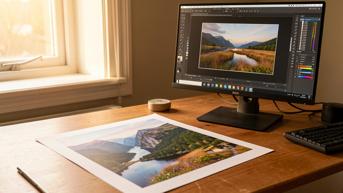
A print is the final exam your photo never takes on a screen. The honest path runs in this order: edit on a calibrated monitor, soft-proof to the paper you will actually use, then either feed a pigment inkjet at home or send a properly profiled file to a lab. Most “my prints look muddy” problems are not the printer — they are an uncalibrated screen and a missing paper profile, and both are fixable in an afternoon.
I shoot two systems — a 40-megapixel Fujifilm X-T5 and a full-frame Sony a7 IV — and for years the thing that taught me the most about my own glass was not pixel-peeping at 100%. It was hanging a 24-inch print on a wall and walking up to it. Paper is unforgiving in a way a backlit display is not: it shows you flat color management, a soft corner, a crushed shadow, an over-sharpened edge. This guide is the whole chain, from the develop module to the frame on the wall, written the way I actually run it across both mounts.
Printing is the single fastest feedback loop I know for improving as a shooter. On a screen everything is lit from behind, scaled to fit, and forgiving. On paper the image has to stand on its own reflected light, at a fixed size, with no zoom. A photo that looked sharp at web resolution can reveal that you missed focus by a hair; a sky that looked smooth can band; a portrait that looked richly toned can turn out flat because you graded for a glowing display, not for ink sitting in paper fibers.
That is why I treat the print as the brief, not the afterthought. When I chart a lens — a tripod-locked aperture sweep from wide open to f/8 to f/16 — I am ultimately asking whether the differences I see on the chart survive into a print at the size I would hang it. Half of what pixel-peepers argue about online vanishes at 16×24 inches viewed from four feet. The other half — field curvature smearing a corner, longitudinal CA fringing a backlit branch — is exactly what a print exposes. If you want to know which of your lenses actually earn their place in the bag, print their files big and look. My deep dives on post-processing workflow and getting the most from RAW files feed directly into this — a print is only as good as the file you hand it.
Everything in printing comes down to one idea: the numbers in your file have to mean the same color on every device they pass through. A calibrated monitor, a correct working color space, a printer-and-paper profile, and a soft-proof preview are the four links in that chain. Break any one and you get the classic complaint — prints come back darker, warmer, or flatter than the screen.
Start with the monitor. An uncalibrated display is the number-one cause of bad prints. I calibrate mine on a schedule with a hardware sensor so that what I see in Lightroom Classic is a known reference, not whatever the panel drifted to. Without that, you are editing blind and “fixing” colors that were never wrong. Brightness matters as much as color: a screen cranked to retail-floor brightness will make you edit prints too dark, because you keep pulling exposure down to match a display that is far brighter than any sheet of paper reflecting room light.
Next is the working space. I keep RAW files in a wide-gamut space through editing so I never clip saturated colors before the printer gets a chance at them, then let the print pipeline convert to the printer-paper profile at output. The piece most beginners skip is the ICC paper profile — a small file, specific to one printer and one paper, that tells the system how that exact combination reproduces color. Generic profiles are why a glossy file looks plausible on matte paper and then prints sickly. Download the maker’s profile for your paper, or have a custom one made, and soft-proof against it before you commit ink. I wrote a full guide to color profiles for printing because this single step fixes more “muddy print” emails than anything else.
Soft-proofing is the dress rehearsal. It simulates, on your calibrated screen, what the chosen paper can and cannot reproduce — the gamut warning shows you which saturated reds or deep blues fall outside what the paper can hold, so you can pull them back gracefully instead of letting the printer clip them into mud. Rendering intent (perceptual vs. relative colorimetric) decides how out-of-gamut colors get mapped; I default to relative colorimetric for most work and switch to perceptual when an image is full of saturated color that would otherwise clip hard. None of this is exotic — it is built into Lightroom and free profile-based workflows, and ten minutes of it saves a stack of wasted sheets.
This is the first real fork, and the honest answer is that both are right depending on volume and control. A home pigment inkjet gives you total control and instant iteration — you can print, walk to the wall, adjust, and reprint in twenty minutes — but the printer is the cheap part and ink plus quality paper is the ongoing cost. A lab spreads its hardware cost across thousands of orders, so a one-off large print is usually cheaper sent out than the all-in cost of owning the machine.
I run both. For work prints, proofs, and anything I want to live with on the wall for a week before deciding, I print at home where the feedback loop is instant. For final large pieces, metal, acrylic, or anything I want behind glass for years, I send a profiled file to a lab whose paper profiles I trust. If you are choosing, start with my breakdown of printing photos at home for the owner’s-cost reality, and the comparison of online printing services for when sending out makes more sense. The trap to avoid is buying a printer to “save money” and then printing six times a year — the ink dries in the heads and you have spent more than a decade of lab orders would have cost.
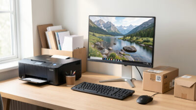
If you decide to print at home, the printer decision is really two decisions: dye versus pigment, and how wide you need to go. Dye inks sit on the surface and give punchy color cheaply, but they are less archival and more prone to fading and metamerism. Pigment inks sit as solid particles, hold color for decades behind glass, and render neutral black-and-white far better — which is why every serious photo printer worth buying is pigment. Width is the other axis: a 13-inch printer covers most enthusiast work and fits on a desk; a 17-inch or 24-inch machine is for people who hang big and print often enough to justify the footprint and ink.
Black-and-white deserves its own note. If you shoot mono seriously, the number of distinct gray inks a printer carries matters more than its color gamut, because dedicated gray and matte/photo-black inks are what keep monochrome prints neutral instead of drifting green or magenta in the shadows. I go deep on specific machines and the dye-versus-pigment math in my best photo printers guide for 2026 — that is the article to read before you spend, because the wrong printer is an expensive way to learn this. As an aside, the body matters far less here than the file: a clean 24-megapixel file from a well-exposed frame prints beautifully, and you do not need the latest enthusiast body to make wall-worthy prints.
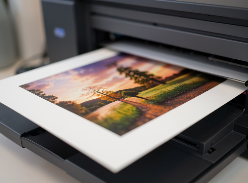
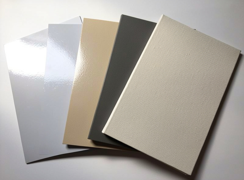
Paper changes a photograph more than almost any edit you can make to the file. The same image on glossy, luster, matte, and cotton rag reads as four different pictures. Glossy maximizes apparent sharpness and color saturation but throws reflections and shows fingerprints; luster (sometimes called pearl or satin) is the workhorse for color work because it holds saturation and detail with far fewer reflections; matte and cotton-rag fine art papers trade some punch and deep black density for a tactile, painterly surface that flatters portraits, landscapes, and anything you want to feel like an object rather than a snapshot.
The trade-off that surprises people is black density. Glossy and luster papers hold a deeper, richer black (higher Dmax) than uncoated matte papers, so a high-contrast night scene snaps on luster and goes slightly soft and gray on cotton rag. That is not a flaw — it is the look — but you have to choose it on purpose. Canvas is its own world: textured, no glass, gallery-wrapped over a frame, forgiving of slightly soft files because the weave breaks up fine detail anyway. I compare the two surfaces people agonize over most — canvas versus fine art paper — in its own guide, because the right answer depends entirely on the image and where it will hang.
Here is the rule I live by: shoot for the print, crop for the page. A 40-megapixel file gives me enormous latitude — I can crop hard for a web layout and still hold a sharp 16×24 print of the full frame — but resolution only matters relative to print size and viewing distance. The familiar 300 pixels-per-inch target is a comfortable native resolution for small prints viewed close; it is not a hard wall. Large prints are viewed from farther away, so you can print at 180 to 240 ppi and the eye never resolves the difference. A billboard is a few pixels per inch and looks fine from the road.
What this means in practice: do the math from viewing distance, not from a superstition about 300 ppi. A 24-megapixel file prints a flawless 16×20; a 40-megapixel file prints a clean 20×30 and crops well besides. Modern resolution-aware upscaling extends this further than people expect for the rare time you crop hard and still want it big. And sharpening is output-dependent — the amount that looks right on screen is not the amount a matte fine art paper needs, because the ink spreads slightly into the fibers. Sharpen for the specific output: more for matte, less for glossy, and always at the final print size. If you are still building your develop habits, my Lightroom develop module workflow covers output sharpening and export settings in order.
A great print badly mounted is a wasted print. The display chain is its own craft: mounting keeps the print flat, matting gives it breathing room and lifts the surface off the glass, and the frame and glazing protect it while setting the mood. The single most important upgrade for anything that will live in daylight is UV-protective glazing — ordinary glass lets prints fade, and museum glass cuts both UV and reflections at a real but worthwhile cost. For prints you will rotate often, a simple mat-and-frame combo beats permanent dry-mounting because it is reversible.
Canvas skips the glass entirely — it gallery-wraps over stretcher bars and hangs as an object, which is why it suits large, lower-contrast images in living spaces. Metal and acrylic face-mounts go the other direction, throwing saturation and gloss for a modern look that suits punchy color work. I walk through the whole sequence — mounting boards, mat windows, frame depth, glazing choices, and how to hang a set so it reads as a wall and not a scatter — in my mounting and framing guide. Get the print right first; the frame cannot rescue a flat file, but it can absolutely ruin a great one.
There is no single best way to make a print — there is a best way for a given image, size, and how often you do it. The table below is how I decide between the four routes I actually use, from a quick proof on the home machine to a gallery-wrapped canvas sent out.
| Route | Best for | Up-front cost | Color control | Turnaround |
|---|---|---|---|---|
| Home pigment inkjet | Proofs, small-to-medium prints, frequent printing | High (printer + ink) | Total — you own the profile and paper | Minutes |
| Pro lab (paper print) | One-off large prints, archival color and B&W | Per-order only | High if you soft-proof to their profile | Days |
| Consumer online service | Cheap volume, gifts, snapshots | Low per order | Limited — often no profiles | Days |
| Canvas / metal / acrylic | Large statement pieces, no glass | Per-order, higher | Moderate, surface-dependent | Days to a week |
Read the columns against your own habits. If you print a couple of times a month and want to iterate, home wins on the feedback loop. If you print twice a year and want it perfect, a lab wins on cost and consistency. The services comparison sorts the labs by where they actually shine.
Here is the order I run, every time, so nothing gets skipped. First, I cull and develop the file in Lightroom Classic on a calibrated monitor, working in a wide-gamut space and grading for the print, not for a glowing phone screen — my culling workflow and color grading approach both feed this stage. Second, I decide paper and size, then soft-proof against that exact paper’s ICC profile, pulling out-of-gamut saturated colors back into range and setting rendering intent. Third, I set output sharpening for the chosen surface at final print size — more for matte, less for glossy.
Fourth, I print. At home that means feeding the right paper, selecting the matching profile, and letting the printer manage color (never double-managing between the application and the driver, which is the classic color-shift bug). Sent out, it means exporting to the lab’s spec and trusting the profile I soft-proofed to. Fifth, I let the print dry and “dry down” — inks shift slightly as they set, especially on matte — before I judge it under daylight-balanced light, not under warm tungsten that lies about color. Sixth, I mount, mat, and frame with UV glazing for anything that will see daylight. The whole loop is the same discipline I bring to charting glass: change one variable, look at the result, decide on evidence rather than hope. Everything I shoot — landscapes, product work, even the documentation of a welded rig or a leather piece — ultimately gets judged this way, on paper, at size.
Almost always an uncalibrated, too-bright monitor. A retail-bright screen makes you edit prints too dark to match it. Calibrate with a hardware sensor and lower screen brightness toward print-viewing levels, then soft-proof to the paper profile before printing.
No. 300 ppi is a comfortable native resolution for small prints viewed close, not a hard wall. Large prints are viewed from farther away and look flawless at 180 to 240 ppi. Calculate from viewing distance, not from the 300 ppi superstition.
Only at volume. The printer is cheap; ink and quality paper are the ongoing cost. If you print a few times a month and want instant iteration, home wins. If you print twice a year, a lab is cheaper because it spreads hardware cost across thousands of orders.
Pigment for anything you care about. Pigment inks hold color for decades behind glass, resist fading, and render neutral black-and-white far better. Dye is punchier and cheaper but less archival. Every serious photo printer worth buying uses pigment inks.
It is a small file specific to one printer and one paper that tells the system how that exact combination reproduces color. Without the right profile, color shifts and prints look muddy. Download the paper maker’s profile or have a custom one made, then soft-proof to it.
Luster is the all-round workhorse: saturated, detailed, few reflections. Glossy maximizes apparent sharpness and color but throws reflections. Matte and cotton rag give a tactile, painterly surface with shallower blacks. Choose the surface on purpose for the image.
Printing photos at home is worth it when you print often enough to use the…
Leave a Reply