Mobile Photo Editing: Real Edits From Your Phone
Mobile photo editing is no longer a toy. Apps like Lightroom Mobile and Snapseed open…
Color grading is the creative stage where you shape an image’s mood through color — cool shadows, warm highlights, a unified palette across a set. It is distinct from color correction, which fixes white balance to make colors accurate. Correction makes the photo right; grading makes it yours. The best grades are felt, not noticed, and restraint is the whole skill.
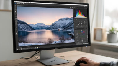
I grade every frame that leaves my catalog, on a calibrated monitor, because color decisions made on a lying screen are wrong for everyone else. Across my two systems — the Fuji X-T5 and the Sony a7 IV — I lean on a consistent, subtle palette rather than chasing whatever look is trending. This guide separates correction from grading, walks the actual tools, and explains how to build a look that still holds up a year later. It is the creative half of my full photo editing workflow guide, and it comes after the global develop steps in my Lightroom for beginners walkthrough.
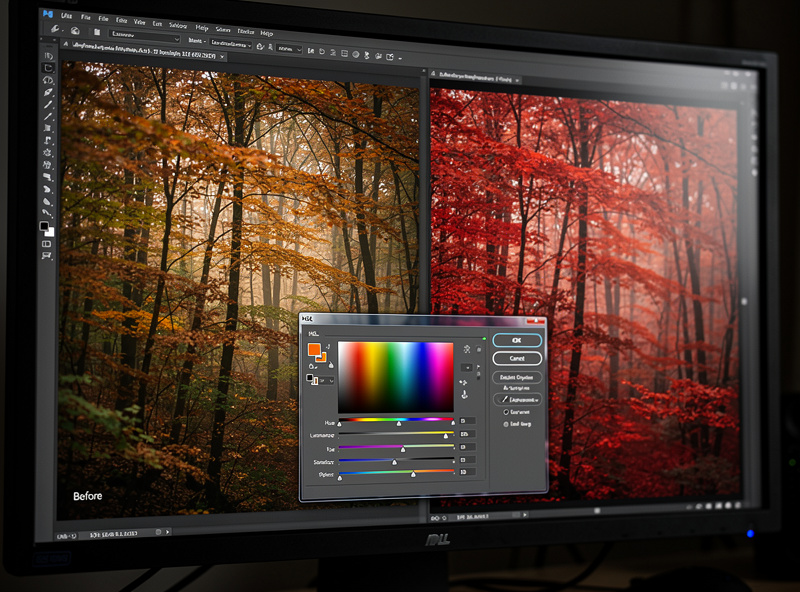
These two get confused constantly, and the difference matters. Color correction is technical: setting white balance so neutral grey reads as neutral, fixing a green cast from fluorescent light, making skin tones look like real skin. It is about accuracy. Color grading is creative: deciding that the image should feel warm and nostalgic, or cool and clinical, and pushing color toward that feeling on purpose.
The order is fixed — correct first, grade second. You cannot build a deliberate look on top of a wrong white balance, because the cast you failed to fix fights every creative move you make. Get the file accurate and neutral, confirm skin and known-neutral elements look right, and only then start grading. Skipping correction is why so many heavily-graded beginner images look not stylish but simply broken.
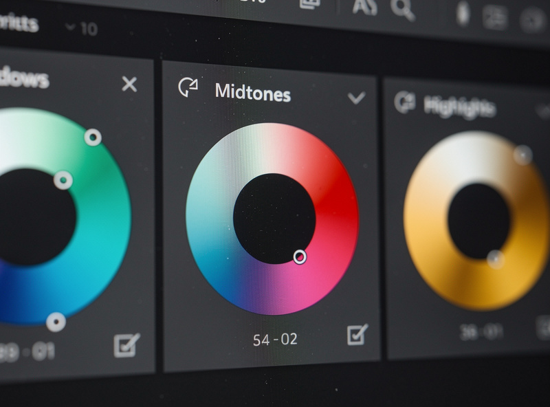
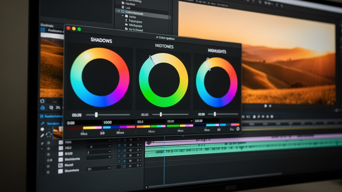
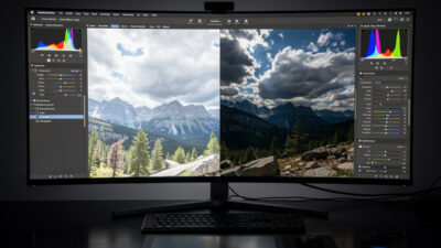
Modern editors give you three main grading instruments. Color wheels (the color grading panel) let you push shadows, midtones, and highlights toward different hues independently — the classic move is cool shadows and warm highlights for a cinematic feel. HSL lets you isolate a single color and shift its hue, saturation, and luminance without touching the rest, which is how you tame one screaming color or deepen a sky. The tone curve, run per-channel, is the most powerful and least obvious grading tool of all.
I do most of my grading with HSL and the color grading wheels, and reach for per-channel curves when I want a precise split-tone. The trap is using all three at once and over-saturating into chaos. Pick the tool that matches the job: wheels for overall mood, HSL for one problem color, curves for fine split-toning. A good grade usually involves small moves on one or two tools, not big moves on all three.
A signature look is just a set of grading decisions you apply consistently. If your shadows always lean slightly teal and your highlights slightly warm, your work gains a recognizable coherence across an entire portfolio or client set. The way to build one is to grade a frame you love, then save those moves as a preset and apply them as a starting point to similar images — adjusting per frame because the light is never identical.
Consistency is what separates a body of work from a pile of one-off edits. I keep my palette deliberately restrained and reuse it, so the landscape, the product shot, and the portrait all feel like they came from the same eye. Resist the urge to grade every image in a different trendy style — that reads as a beginner trying on costumes. Find a look that suits your subjects, refine it over time, and let it become a quiet signature rather than a loud effect.
Color grading is the stage where display accuracy is non-negotiable. If your monitor runs too blue, you will over-warm every image to compensate, and your grade will look orange on every other screen and in print. A wide-gamut, calibrated display shows you the colors you are actually choosing rather than a distorted version of them. This is the single biggest hidden cause of “my grades look wrong everywhere else.”
I calibrate roughly monthly and grade in consistent, dim ambient light so my eye is not fooled by a sunny window. As an Amazon Associate I earn from qualifying purchases. For grading specifically, a wide-gamut color-accurate editing monitor is the tool that makes the work trustworthy — I link it because grading on a poor panel wastes every careful decision you make. Pair it with a hardware calibrator and your colors finally mean the same thing on your screen as everyone else’s.
The most common grading mistake is doing too much. Crushed teal shadows, radioactive orange skin, a heavy matte film fade — these scream “edited” and date the image the moment the trend passes. The grades that hold up are subtle: a viewer feels the mood without being able to point at the color move that created it. If someone’s first reaction is “nice grading,” you overdid it.
My working method is to grade until it looks right, then pull every move back by a third, then walk away and check it again the next day with fresh eyes. Skin tone is the canary — the moment skin goes orange or green, the grade has gone too far, no matter how good the landscape behind it looks. Subtlety ages well; intensity ages badly. The most experienced colorists I respect use fewer moves, not more.
| Tool | Best for | Risk if overused |
|---|---|---|
| Color grading wheels | Overall mood, split-tone shadows/highlights | Muddy, unnatural color casts |
| HSL | Isolating and fixing one color | Banding, unnatural single-color shifts |
| Per-channel curves | Precise split-toning and contrast | Color crossovers, broken skin tones |
| Saturation / Vibrance | Global color intensity | Radioactive, cartoonish color |
| Presets | Consistent starting look across a set | One-size grade that fights mixed light |
Correction is technical: setting white balance and fixing casts so colors are accurate. Grading is creative: pushing color toward a mood, like cool shadows and warm highlights. Correct first to make the photo right, then grade to make it yours.
Three main ones: color grading wheels for shadows, midtones, and highlights; HSL to isolate a single color’s hue, saturation, and luminance; and per-channel tone curves for precise split-toning. Most good grades use small moves on one or two of these.
Grade one image you love, save those moves as a preset, and apply it as a starting point to similar shots, adjusting per frame. A restrained, reused palette gives your portfolio a recognizable signature instead of one-off trendy edits.
Almost always an uncalibrated monitor. If your screen runs too blue, you over-warm every image to compensate and the grade looks orange everywhere else. A wide-gamut calibrated display and a hardware calibrator fix this.
Watch skin tones: if they go orange or green, the grade is too far. If a viewer notices the color editing before the photo, it is too much. Grade, pull every move back by a third, and check again with fresh eyes the next day.

Mobile photo editing is no longer a toy. Apps like Lightroom Mobile and Snapseed open…
Lightroom for beginners comes down to one screen: the Develop module. Import your photos, cull…
RAW photo processing is the act of converting your camera’s raw sensor data into a…
Leave a Reply