Onion-Ring Bokeh: When Aspherical Lenses Show Their Texture
Onion-ring bokeh is the fine concentric rings you see inside out-of-focus highlights on some modern…

Good bokeh is a lens drawing its out-of-focus areas smoothly and quietly — round, evenly-lit blur circles with soft edges that never pull your eye away from the subject. On my charts it comes down to three things: a well-rounded aperture, deliberately under-corrected spherical aberration behind the focal plane, and enough subject-to-background separation to let the blur grow. The clearest single test is a string of point lights eight to ten meters behind a near subject, shot wide open at f/1.2 to f/1.8 — that one frame shows the disc shape, the fill, and the corner squeeze all at once.
That is the short answer, but bokeh is the one lens trait that no spec sheet measures and no MTF chart predicts. I have shot lenses that resolve brilliantly on a flat test wall and render backgrounds like broken glass, and cheap vintage primes that smear a meadow into watercolor. After years of running a tripod-locked aperture sweep on every lens I buy across two mounts, here is how I actually judge the quality of a lens’s blur — and what is happening inside the barrel to produce it.
Bokeh is not the amount of background blur — that is depth of field, and it is mostly physics you control with distance and aperture. Bokeh is the character of that blur: how a defocused point of light is shaped, edged, and filled. Two lenses at the same f-stop with the same subject can throw the same depth of field and render it completely differently.
The vocabulary I use on this site is borrowed from how shooters have described it for decades: “creamy” or “smooth” for blur that melts, “busy” or “nervous” for blur that fizzes with hard edges and double lines. The Japanese loanword boke — the root of bokeh — simply means blur or haze — so “good bokeh” is shorthand for blur of good quality. The honest truth is that quality is partly subjective: a swirly Helios background that one shooter calls magical, another calls a distracting mess. But the optical causes behind each look are not subjective at all, and once you can name them you can predict how any lens will draw before you ever mount it.
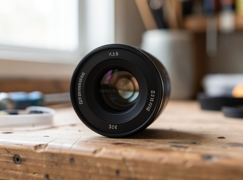
Three design choices inside the barrel do most of the work. Get them right and even a modest lens renders beautifully; get them wrong and no amount of sensor resolution saves the picture. Here is what each one does.
When you stop a lens down, the iris blades form the opening that every out-of-focus highlight is shaped after. Wide open, the highlight takes the shape of the front element — usually a clean circle in the center of the frame. Stop down and the highlight becomes the shape of the iris: a heptagon, a nonagon, a near-circle, depending on how many blades the lens has and whether they are straight or curved. More blades and rounded (“curved”) blades keep those highlights round when stopped down, which most shooters read as cleaner bokeh. I dig into exactly how much this matters — and where it stops mattering — in the aperture blade count guide.
This is the one almost nobody talks about, and it is the single biggest driver of “creamy” versus “nervous.” A defocused point of light is not a flat disc — it has a brightness profile across its diameter. If the lens is under-corrected for spherical aberration, the disc is brightest in the center and fades softly toward the edge, so blur circles overlap and melt together: creamy bokeh. If it is over-corrected, the disc is brightest at its rim — a bright ring with a darker center — and those hard outlines stack into the busy, doubled-edge look. The classic portrait lenses people prize for their drawing are deliberately left slightly under-corrected behind the focal plane. I unpack the visual difference in nervous versus creamy out-of-focus areas.
Aspherical elements fixed a generation of optical problems — they tame spherical aberration and let designers build fast lenses small. But a molded aspherical surface can carry faint concentric ridges from manufacturing, and those ridges print straight into every defocused highlight as fine rings: onion-ring bokeh. It is the price of modern correction, and it shows up most in bright specular highlights at night. That trade-off — sharpness and compactness bought with a textured blur disc — gets its own teardown in the onion-ring bokeh guide.
Before you blame a lens, understand that you control most of the blur through geometry. The amount of background blur grows with three things you set at the moment of shooting: a wider aperture, a longer focal length, and — the one beginners forget — the physical distance between your subject and the background. Push your subject far from the wall behind them and even a modest f/2.8 zoom throws a soft background; press them against it and an f/1.2 prime cannot save you.
Sensor format plays in too. To frame the same portrait, a full-frame body uses a longer focal length or closer distance than APS-C, so at a matched aperture it renders a shallower background — one reason I keep a Sony a7 IV next to the X-T5 as a rendering cross-reference. None of this changes the lens’s character, but it changes how much of that character you get to see. If you are trying to wring more separation out of the gear you own, start with getting more background blur without a faster lens before you spend a krona.

Every lens that renders with “character” is really showing you a controlled set of flaws. Knowing them by name is how you read a lens from a single background-heavy sample shot. These are the ones I look for first.
Look at the blur circles in the corner of a wide-open frame and you will often see them squeezed into lemon or cat’s-eye shapes, all leaning toward the center. That is mechanical vignetting — the lens barrel and rear elements clip the light cone for off-axis points. It is strongest wide open and largely gone by f/2.8. Used deliberately it creates a swirl that frames the subject; used carelessly it makes a busy edge. Full breakdown in cat’s-eye bokeh at the frame edge.
Point sources behind the subject — fairy lights, sun glinting off water, gaps in foliage — render as the bokeh “balls” everyone chases. Their shape (round vs polygonal), their edge (soft vs hard-ringed), and their fill (smooth vs onion) are the clearest single test of a lens’s blur quality, because a specular highlight shows you the raw shape of the defocus disc with nothing to hide behind. How to shape and place them is in bokeh balls and specular highlights.
On high-contrast out-of-focus edges, under-corrected fast lenses paint a green halo behind the focal plane and a magenta halo in front of it. It is not lateral chromatic aberration — you cannot fix it by pushing a slider as cleanly — and on a 40MP sensor it is brutally visible wide open. A little stopping down usually kills it. I flag it because shooters often mistake green-fringed bokeh for “bad” bokeh when it is really a separate, correctable problem.
It helps to separate what you control from what the lens decides. This is the cheat sheet I wish I had when I started charting glass — what each factor changes, and whether you or the optical designer owns it.
| Factor | What it changes | Who controls it | Practical takeaway |
|---|---|---|---|
| Subject-to-background distance | How large/soft the blur grows | You, at the shot | The cheapest, biggest lever — move the subject forward |
| Aperture (f-stop) | Depth of field and highlight size | You | Wider = more blur but also more visible flaws |
| Focal length | Magnification of the background | You (lens choice) | Longer lenses enlarge and smooth the background |
| Blade count and curvature | Highlight shape when stopped down | Lens design | 9+ rounded blades stay round past wide open |
| Spherical aberration correction | Creamy vs nervous disc fill | Lens design | The real “drawing” signature — untouched by you |
| Aspherical surface quality | Onion-ring texture in highlights | Lens design | Trade-off for sharpness and compact size |
| Mechanical vignetting | Cat’s-eye highlights at edges | Lens design + format | Worst wide open, cleans up stopped down |
I do not trust a bokeh verdict from a single online sample, because background distance and light change everything. So I chart it the same way every time. Against a flat wall I run a tripod-locked aperture sweep — wide open, then each stop to f/8 — to find where the lens is sharpest and how the rendering firms up as I close the iris. Then I move to the part that actually tests bokeh: a backlit point source.
I set a string of small lights eight to ten meters behind a near subject, focus close, and shoot the same sweep. Wide open tells me the disc shape, the cat’s-eye squeeze at the corners, and whether the fill is smooth or ringed. By f/2.8 I can see how fast the cat’s-eye cleans up and whether the blades are keeping the highlight round. That single backlit frame, pixel-peeped at the corners and the center, tells me more about how a lens draws than any MTF curve ever printed. The MTF describes sharpness; it says nothing about the brightness profile of a defocus disc, which is the whole game.
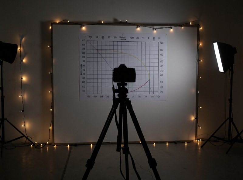
The field check matters just as much, because a chart cannot reproduce dappled golden-hour light through trees. I take the lens out at the same hour I would actually use it, shoot a real subject against a busy, light-flecked background, and look at the print, not the screen at 200%. Some flaws that look alarming at pixel level vanish in an A3 print; others that the chart barely shows become the whole mood of the image. Reading the curve, then proving it on the wall, then confirming it in a print — that is the method this whole site is built on.
You can predict a lens’s bokeh from its design and a couple of sample frames without ever touching it. First, count the blades and check whether they are curved — the spec sheet lists it. Second, look for the word “aspherical” in the optical formula; more aspherical elements often means crisper, more clinical rendering and a higher risk of onion-ring in night highlights. Third, find a sample shot with hard specular highlights in the corners and zoom in: round, smooth, evenly-lit balls mean a well-mannered lens; lemon-shaped, hard-ringed, or onion-filled balls tell you exactly which flaw you are buying.
This is also where focal length and use case meet. A portrait shooter wants smooth, large, well-corrected blur and will pay for it — that is the whole reason fast 56mm, 85mm, and 135mm primes command a premium. A landscape shooter stopping down to f/8 barely cares, because most of these flaws live wide open. Match the glass to the job: my portrait lens recommendations and the broader guide to focal lengths and lens types both walk through which renderings suit which work, and the prime versus zoom breakdown covers why the fast primes earn their keep here.
If you are shopping specifically for a bokeh-first portrait lens, a fast short telephoto prime is where the money goes — something in the 56mm-to-85mm range at f/1.2 to f/1.8. You can compare current fast portrait primes for fast 85mm portrait primes to see the field, but read the rendering notes above before you fixate on the aperture number. As an Amazon Associate I earn from qualifying purchases.
Here is the contrarian part: good bokeh is not always smooth bokeh. A clinically creamy background can read as flat and characterless, while a touch of structure adds depth and place. Documentary and environmental portraits often want a background you can still read — a hint of the room, the workshop, the street. That is why I keep an adapted swirly vintage prime in the bag alongside the clinical modern glass: different jobs, different draw.
The deciding question is always what the blur is doing for the subject. If the background is fighting the face, you want it smoother and farther. If the background is telling the story, you want just enough separation to lift the subject without erasing the context. And you are not limited to the background — a soft out-of-focus element in the foreground adds a layer of depth that a clean frame cannot, which is the technique I cover in using out-of-focus frames to add depth. Bokeh is a compositional tool, not a contest to win at f/1.2. The exposure and aperture decisions behind it tie straight back to the aperture guide and the exposure triangle, and which mount you are buying into shapes your options too — see the lens mount guide.
This hub is the map; each guide below is a deep-dive into one piece of how a lens draws its blur.
Good bokeh comes from three things: a well-rounded aperture (more curved blades), spherical aberration deliberately left slightly under-corrected behind the focal plane so blur discs fade softly at the edges, and clean aspherical surfaces that do not print onion rings. None of these show on an MTF chart, which only measures sharpness.
Not by itself. Blade count and curvature only shape the highlight when you stop down from wide open; wide open the disc is round regardless. Nine or more curved blades keep highlights round at f/2.8 to f/5.6, but the smoothness of the blur fill is driven by spherical aberration correction, not blade count.
That nervous, doubled-edge look comes from a lens that is over-corrected for spherical aberration, so each out-of-focus disc is brightest at its rim instead of its center. The bright outlines stack into hard double lines. It is most visible wide open against a high-contrast background and softens as you stop down.
Yes. Move your subject farther from the background, get physically closer to your subject, and use a longer focal length to frame the same shot. Each of those increases background blur at the same f-stop, often more than swapping an f/2.8 lens for an f/1.8 one would.
That is cat’s-eye bokeh, caused by mechanical vignetting: the lens barrel clips the light cone for points away from the center, squeezing round highlights into lemon or cat’s-eye shapes that lean toward the middle. It is strongest wide open and mostly disappears by f/2.8.
No. Smooth, creamy bokeh suits clean portraits where the background should disappear, but documentary and environmental work often wants a readable background that grounds the subject in a place. A little structure in the blur can add depth and story. Bokeh is a compositional choice, not a quality you maximize.

Onion-ring bokeh is the fine concentric rings you see inside out-of-focus highlights on some modern…

Cat’s-eye bokeh is the lemon or eye shape that out-of-focus highlights take near the edges…

Bokeh balls are the round glowing orbs a lens makes from out-of-focus points of light…
Leave a Reply