RAW Photo Processing: Getting the Most From Your Files
RAW photo processing is the act of converting your camera’s raw sensor data into a…
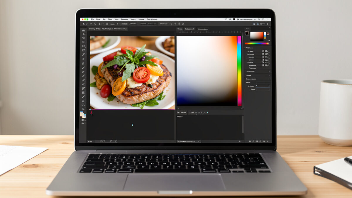
Editing food photos starts and ends with white balance: shoot RAW, set the white balance off a neutral point, then nudge it slightly warm, because edible food almost always wants to sit a touch warmer than technically “correct.” Get color right and the edit is roughly 80% done — no amount of contrast or sharpening rescues a photo that’s gone yellow-green. Color is what tells the brain “this is safe and delicious to eat.”
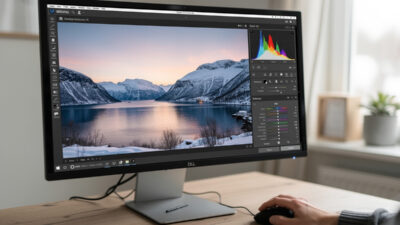
I develop every food frame in Lightroom Classic on a calibrated monitor, and I spend more time on the white balance slider than on everything else combined. The reason is simple: our appetite response is wired to color. Meat that reads too cool looks raw or spoiled; vegetables that skew yellow look wilted; a latte that goes green looks undrinkable. Here’s the exact color-first workflow I use to make food look edible, and the traps that make it look like a morgue.
Editing is the final lever in the beginner workflow, and it can only refine what the camera captured. If your color is a mess at capture — mixed light, tungsten bulbs — even RAW can only do so much, which is why nailing your window light matters before any slider does.
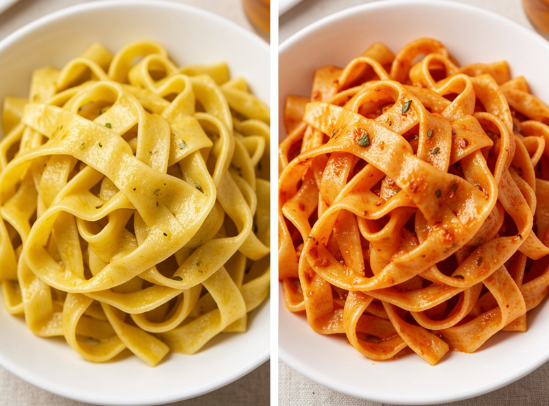
Because color is the primary appetite signal, and food shot under the wrong light color reads as spoiled. Tungsten bulbs (around 2700–3200K) turn everything jaundice-yellow; fluorescent and mixed light add a sickly green; shade goes cold and blue. Any of these makes food look inedible before the viewer registers anything else. Correcting the color cast is the first and most important edit.
The technical term for this is color balance — adjusting the relative intensities of colors so that neutral tones (whites and greys) render neutral, which in turn makes every other color read true. Cameras try to guess it automatically and constantly get food wrong, because a dish is often dominated by one color that fools the auto white balance. A bowl of tomato soup pushes auto WB to overcompensate and cools the whole frame; a plate on dark wood drags it warm. That’s exactly why I take control of white balance manually instead of trusting the camera’s guess. If the fundamentals of white balance are new, Cambridge in Colour’s white balance tutorial is the clearest primer I know.
The stakes are highest with anything protein or dairy. Cool-shifted meat looks raw or grey; warm-shifted cream looks off; green-cast cheese looks moldy. I’ve watched a genuinely delicious dish look repulsive on screen purely because the color was three hundred Kelvin cold, and snap into “I want that” the instant I corrected it. Nothing else in the edit moves the needle like this.
Shoot RAW, then click the white balance eyedropper on something that should be neutral grey or white in the image — a white plate rim, a neutral napkin, a grey prop. That single click removes the color cast and gives you a correct baseline. From there, warm it slightly to taste. RAW is essential because it stores white balance as adjustable data, not baked-in pixels.
Here’s my exact sequence in Lightroom. One: with the RAW file open, grab the white balance selector (the eyedropper) and click a spot that should be truly neutral — the highlight side of a white plate, a grey card if I placed one, an unpainted ceramic rim. The image instantly corrects to neutral. Two: I look at the food and warm the temperature a few hundred Kelvin, because a clinically neutral dish looks dead — appetizing food skews warm, like it’s under kitchen or golden light. Three: I check the tint slider (green–magenta) and pull a hair toward magenta if there’s any green cast, since green is the most appetite-killing shift of all. That’s the whole white balance edit, and it takes fifteen seconds once you can see it.
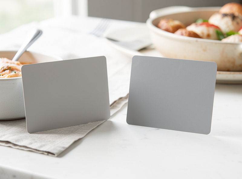
The single best insurance is to place a neutral reference in one frame. I keep a small 18% grey card in my bag; I shoot one frame with it in the scene, click the eyedropper on it in Lightroom, then copy that white balance to every other frame from the same setup. It turns white balance from guesswork into a two-second, repeatable step. A white plate or napkin works in a pinch, but a real grey card is unambiguous and never lies about neutral.
It depends entirely on what lit the food. Daylight sits near 5500K and needs little correction; tungsten bulbs need a big cool correction; shade needs warming; mixed light is the nightmare that no single setting fixes. Knowing the starting cast tells you which way to push. This is also the strongest argument for shooting in clean window light in the first place — one consistent color to correct.
Here’s the cheat sheet for common food-shooting light:
| Light source | Approx. color temp | Cast it adds | Correction in editing |
|---|---|---|---|
| North window / daylight | 5000–6000K | Neutral to slightly cool | Minimal; nudge warm to taste |
| Golden-hour sun | 3000–4000K | Warm orange | Cool slightly if too heavy |
| Tungsten bulb | 2700–3200K | Strong yellow-orange | Cool hard toward blue |
| Fluorescent / LED (cheap) | Varies | Green-magenta cast | Pull tint toward magenta |
| Open shade | 6500–7500K | Cold blue | Warm toward yellow |
| Mixed (window + bulb) | Inconsistent | Split cast, hard to fix | Kill one source at capture |
The bottom row is the real lesson: mixed light can’t be white-balanced cleanly, because the warm and cool areas of the frame need opposite corrections. Fix one and the other goes wrong. The only real fix is at capture — turn off the bulbs and shoot pure window light, which I harp on in the window light guide. Editing is powerful, but it can’t un-mix light.
Modest contrast, a careful shadow lift, and restrained saturation — in that order, and all with a light hand. Once color is right, add gentle contrast for punch, lift the deep shadows just enough to keep detail without flattening, and increase vibrance a touch while keeping saturation low. Over-saturated food looks plastic and, oddly, less appetizing. The goal is natural, not candied.
My post-white-balance moves are deliberately small. A little contrast to give the image structure; a lift of the shadows I deliberately let go dark at capture, but only enough to recover a hint of detail, never enough to kill the mood; and then color intensity, where I lean on vibrance (which protects already-saturated tones) over the blunt saturation slider. The trap here is pushing saturation to make food “pop” — it tips fast into artificial, and hyper-saturated food reads as fake and, weirdly, less tasty. I’ll also do local work: a subtle radial brighten on the hero, a touch of clarity on a crust or crumb to bring out the texture I lit for in the texture shots, and a gentle darkening of distracting bright edges.
A calibrated monitor underpins all of it. I calibrate mine because I edit for the print as much as the screen, and an uncalibrated display that skews warm or cool makes you “correct” color that was already fine — you’re chasing a lie the monitor tells you. If you deliver only to screens, calibration still matters so your edit looks the same on someone else’s device. This is the same discipline I apply across all my work: color you can’t trust is color you can’t edit.
Two, and they’re linked: leaving the white balance wrong, and over-saturating to compensate. When food looks flat or off, beginners reach for the saturation slider instead of fixing the color cast underneath — which just makes a yellow photo a more intensely yellow photo. Fix white balance first, always. Then add color intensity sparingly, if at all.
My own early food edits are a museum of this exact error. I’d shoot under mixed kitchen light, not fix the green-yellow cast, then crank saturation and contrast trying to force some life into the image — and end up with lurid, plasticky food that looked worse than the flat original. The day I learned to click the eyedropper first and warm to taste, my edits got faster, simpler, and far better. Color correction isn’t the boring technical step before the “real” editing; it is the real editing for food. Nail white balance, keep everything else restrained, and a home-cooked plate under a free window will look every bit as edible as anything in a magazine. What I’d do starting today: shoot one frame with a grey card, correct off it, warm it a hair, and stop touching the saturation slider.
As an Amazon Associate I earn from qualifying purchases.
Shoot RAW, then click the white balance eyedropper on something that should be neutral, such as a white plate rim, a grey prop, or a grey card in the scene. That removes the color cast, then nudge the temperature slightly warm because appetizing food usually looks best a touch warmer than technically neutral.
They were shot under tungsten or fluorescent light. Tungsten bulbs add a strong yellow-orange cast around 2700 to 3200 Kelvin, and cheap fluorescent or LED light adds a green cast. Correct the yellow by cooling the temperature and the green by pulling the tint slider toward magenta.
Slightly warm. Set a correct neutral white balance first, then nudge the temperature a few hundred Kelvin warmer. Edible food reads best a touch warm, as if under kitchen or golden light. Cool-shifted food, especially meat and dairy, looks raw, grey, or spoiled.
It is strongly recommended. RAW stores white balance as adjustable data you can change freely after the fact, while JPEG bakes the color in and only allows limited correction. For food, where color is everything, RAW gives you the latitude to fix casts cleanly.
You have pushed saturation too far, usually to compensate for a white balance that was never fixed. Correct the color cast first, then use vibrance sparingly instead of saturation. Over-saturated food looks artificial and, counterintuitively, less appetizing.
RAW photo processing is the act of converting your camera’s raw sensor data into a…
Lightroom for beginners comes down to one screen: the Develop module. Import your photos, cull…
Natural portrait retouching means cleaning up distractions while keeping the person looking like themselves —…
Leave a Reply