Field Audio for Video: Recording Gear That Fixes Camera Microphone Problems
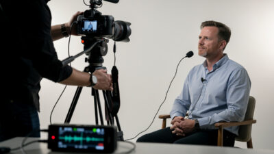
Clean field audio for video photographers requires a $25 lavalier microphone plugged into a $100…
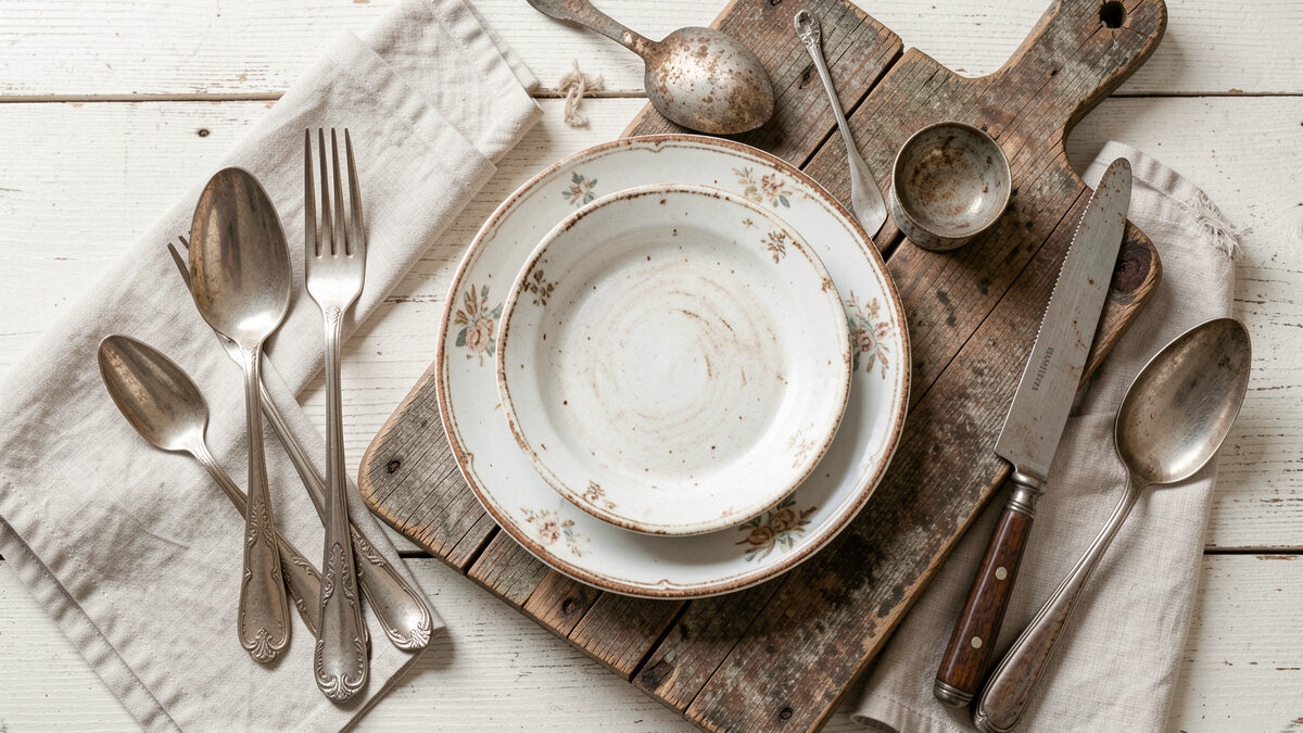
Great food styling costs almost nothing: a black foam board for negative fill, one good surface, and three honest props beat a cabinet full of designer dishware. My entire prop kit is a shoebox of thrift-store cutlery, two cutting boards, and a stack of foam board that ran me under $30 total. Restraint reads as intentional; clutter reads as amateur. The trick is knowing what to leave out.
I’m a lens nerd, not a stylist by training — I care about how glass draws far more than about napkin folds. But you can’t photograph food without styling it, and I quickly learned that the expensive-looking food shots I admired weren’t using expensive props. They were using cheap things, chosen well and used sparingly. Here’s the whole budget system I actually use at my table, prop by prop and surface by surface.
Styling is the fourth lever in the beginner workflow, after light and angle and lens. It won’t rescue a photo shot under a ceiling bulb — fix your window light first — but once the light is right, styling is what turns a good photo into one that looks professionally made.
Three, usually: something to eat with, something to wipe with, and a hint of the ingredient. A fork or spoon, a linen napkin, and a scatter of the same thing that’s in the dish — loose crumbs, a few berries, a sprig of the herb — is enough to tell a story. Add a second small vessel (a little bowl of salt, a cup of coffee) only if the frame feels empty. More than that and you’re decorating, not styling.
The mistake beginners make is treating props as decoration to fill space, when props are really there to imply a human. A half-folded napkin, a spoon resting in the bowl, a fork with a bite already taken — these say someone is about to eat, or just was. That implied presence is what makes food look alive rather than staged. I keep my choices boring on purpose: matte, neutral cutlery that doesn’t throw distracting specular highlights, and linen (or a cut-up flour-sack towel) that reads soft and unfussy. Shiny chrome forks and busy patterned napkins fight the food for attention every time.
Where do you get this cheaply? Thrift stores and your own kitchen. My “prop cutlery” is a $4 handful of mismatched vintage forks and spoons from a charity shop — the slightly worn patina photographs better than shiny new steel. Old linen napkins, a flour-sack towel, a chipped enamel mug: all thrift-store finds, all better on camera than anything new and glossy. You do not need a prop budget. You need an eye for the humble, honest object.
The surface is your background, and it sets the entire mood before the food does anything. Cool, bright surfaces — marble, white-painted board, light stone — suit fresh, clean, airy food. Dark, scarred surfaces — old wood, slate, a rusted tray — suit rustic, moody, hearty food. Matching the surface to the food’s personality does more for the shot than any prop.
Think of the surface as tone of voice. A bright salad or a stack of pancakes with berries wants a light, clean surface that echoes its freshness; put it on dark scarred wood and it feels heavy and wrong. A dark stew, a crusty loaf, a glass of red wine wants a moody surface with texture and shadow; put it on bright marble and it looks clinical. I keep exactly two boards: a light one and a dark one. Between them they cover almost every dish I shoot, and switching from one to the other transforms the same food more than any prop swap could.
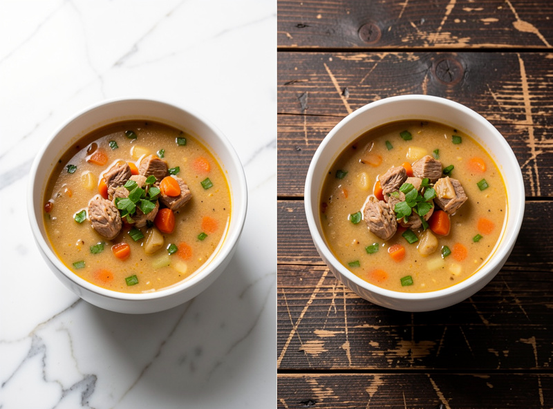
You don’t buy expensive surfaces — you make them. My “marble” is a $12 offcut tile from a stone yard’s scrap bin. My dark wood is a weathered board I sanded and oiled from a pallet. You can paint plywood in flat matte colors, use the back of a scarred cutting board, shoot on a sheet of textured watercolor paper, or lay down old baking parchment. Large-format textured wallpaper offcuts make convincing backgrounds too. Here’s how the common cheap surfaces compare:
| Surface | Mood it sets | Best food for it | Cheap source |
|---|---|---|---|
| Light marble / stone | Fresh, clean, airy | Salads, desserts, breakfast | Stone-yard scrap tile ($10–15) |
| Dark scarred wood | Rustic, moody, hearty | Bread, stew, roasts | Sanded pallet or old board |
| Painted matte board | Graphic, modern, flat-lay | Colorful bowls, flat-lays | Plywood + flat paint |
| Textured paper | Soft, neutral, understated | Baking, pastries | Watercolor paper, parchment |
| Slate / rusted tray | Dark, dramatic, editorial | Cheese, charcuterie, chocolate | Slate offcut, thrift tray |
Negative fill is a black card placed on the shadow side of the food to subtract light, deepening the shadow and giving the dish form and weight. Everyone talks about adding light with a white reflector; almost nobody tells beginners to subtract it. A $4 sheet of black foam board on the near side is often what separates a flat snapshot from a photo with real three-dimensional depth.
Here’s the physics of why it works. When you light food from a window on one side, the shadow side still picks up stray light bouncing around a bright room — off white walls, the ceiling, the table. That ambient bounce fills the shadows and flattens the food. Put a black card on the shadow side and it absorbs that stray light instead of reflecting it, so the shadow deepens and the food gains contrast and dimension. It’s the single most under-used tool in budget food photography, and it costs the price of a coffee. On my table a black flag on the near side is a permanent fixture for anything moody; I only pull it away when I want a bright, high-key look.
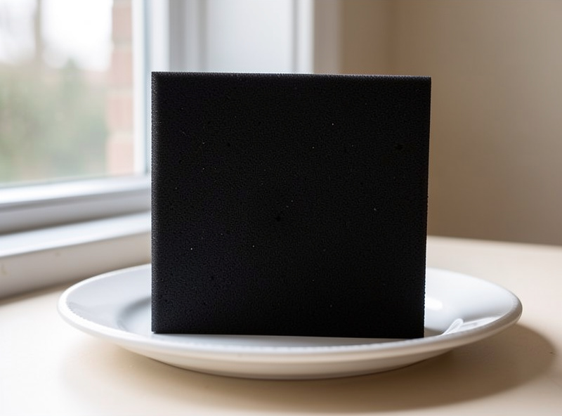
The flip side is fill — a white card that bounces light back into the shadow for a soft, even, airy look. You want one of each. White foam board for bright breakfast-and-salad scenes; black foam board for dark, sculpted, editorial scenes. A single black-and-white foam board pack from a craft store — a few dollars — gives you both, cut to whatever size you need. I explain how these cards interact with window direction in the window light guide; styling and lighting are really the same conversation from two sides.
Use composition, not stuff. Place the hero dish off-center on a thirds line, leave deliberate empty space, and let a prop’s line — a fork, a napkin edge — lead the eye toward the food. Odd numbers of objects read as more natural than even ones. The goal is a frame that feels considered and calm, where every object earns its place and nothing competes with the hero.
The rule of thirds is the workhorse: mentally divide the frame into a three-by-three grid and put the main subject where the lines cross, rather than dead center. It creates tension and flow instead of static symmetry — the rule of thirds is worth internalizing because it applies to every photo you’ll ever take, not just food. From there, balance the frame: if the hero sits top-left, put a smaller element (a folded napkin, a scatter of crumbs) toward the bottom-right so the frame doesn’t tip. And leave negative space — empty table around the food — so the eye has somewhere to rest. Cramming every corner is the number-one amateur tell.
Color is the other quiet lever. A little contrast makes food pop: a few red berries on a pale tart, a scatter of green herbs on a beige risotto, a blue napkin behind an orange dish. Complementary colors — opposites on the wheel — give the most punch, which is why chefs garnish the way they do. A quick read of color theory pays off here: you’re not decorating, you’re using color contrast to guide the eye to the hero. I keep a couple of neutral napkins and one or two colored ones for exactly this — a cheap way to add a pop of complementary color when a dish reads too monochrome.
Add signs of life and honest imperfection. A bite taken from the corner, a drip of sauce on the plate rim, a few crumbs scattered as if the last slice was just cut, a spoon left resting in the bowl — small imperfections say “real food, real moment” far better than a sterile, perfect plate. Perfection reads as fake; a little mess reads as appetite.
This is the counterintuitive heart of styling: too-perfect food looks unappetizing. A flawlessly wiped plate with a geometrically centered portion looks like a catalog render, not a meal. Introduce controlled imperfection — the scatter of the ingredient, the half-folded napkin, the drip — and suddenly there’s a human in the story. I keep a little of the dish’s own ingredient aside to scatter: crumbs from the loaf, a few of the same berries, a pinch of the herb. It ties the props to the food honestly, because they are the food.
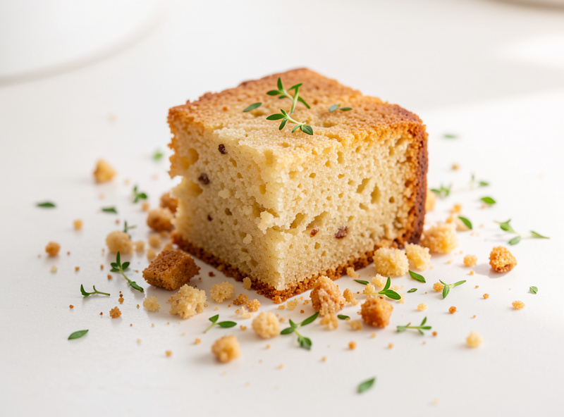
My own worst styling failure taught me this. Early on I photographed a beautifully iced cake, wiped every crumb from the board, centered it perfectly, and shot it clean — and it looked like a plastic display cake in a bakery window. Dead. I re-cut a slice, pulled it slightly away, let a few moist crumbs fall on the board, dropped a fork beside it, and reshot. Same cake, same light, but now it looked like something you’d want to eat right now. The lesson stuck: style toward “just served,” never toward “museum piece.” Cheap props, an honest surface, negative fill, and a little deliberate mess — that’s the whole budget system, and it beats an expensive prop cabinet every time.
From here, texture technique and freshness cues take styling further — how to make a crumb or a crust sing, and how to add honest steam and drips. Both build directly on the surfaces-and-fill foundation here.
As an Amazon Associate I earn from qualifying purchases.
Clean field audio for video photographers requires a $25 lavalier microphone plugged into a $100…
To photograph a sourdough crumb, rake a low side light across the cut face and…

Camera lens or telescope for astrophotography? Focal length matrix, mount and tracking requirements, cost comparison,…
Leave a Reply