Focus Stacking Photography Guide: Sharp Front to Back
Focus stacking merges several frames focused at different distances into one image where every plane…
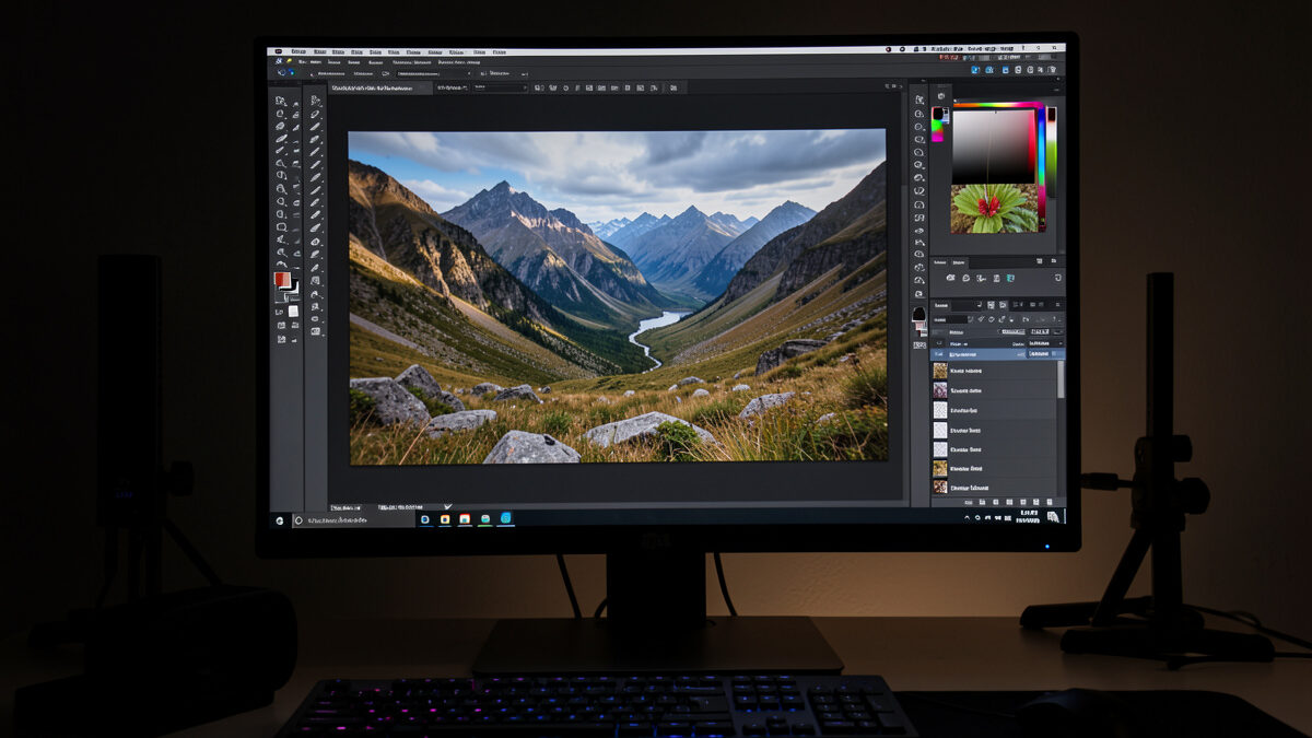
Output sharpening should match where the image is going — a web export at 2048 pixels needs a light touch, a 300 DPI print needs much more. Print-level sharpening on a web image gives haloed edges; web-level sharpening on a print looks soft. Judge it at output size, never at 100% on your monitor.
This is the last link in the sharpness chain, and it’s the one people most often get wrong in both directions — some never sharpen for output at all and wonder why their web images look mushy, others crank a global slider until every edge glows. I run a light capture-sharpen in RAW develop and then a separate, medium-specific output-sharpen at export, and I’ve dialed those numbers in over years of shooting for the print and cropping for the page. Here’s the whole workflow, with the settings I actually use. It completes the sharp-photos system that starts in the field.
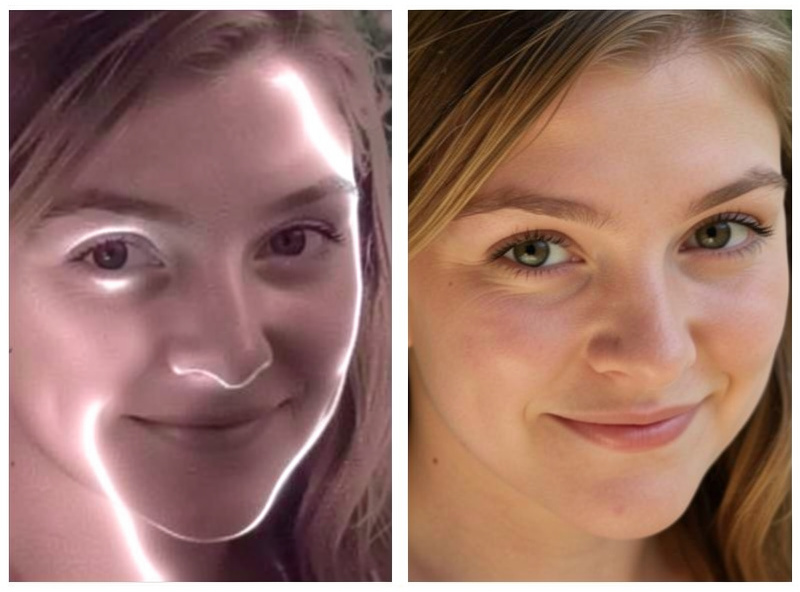
Good sharpening happens in three distinct stages, and conflating them is where most people go wrong. Capture sharpening comes first: every demosaiced RAW file is slightly soft because the sensor’s color filter array and anti-aliasing blur fine detail, so a modest, global capture-sharpen restores what the process cost. Creative sharpening is optional and local — brushing extra bite onto an eye or a texture while leaving skin and sky alone. Output sharpening comes dead last, after resizing to final dimensions, and is tuned entirely to the output medium and size.
The order matters because output sharpening has to happen after you resize. Sharpening works by enhancing edge contrast over a certain pixel radius, and when you downsize a 40-megapixel file to 2048 pixels for the web, you throw away most of those pixels — so any sharpening you did at full resolution is largely discarded, and the downsized image needs its own fresh sharpening pass at the new size. This is why Lightroom’s Export dialog has a separate “Sharpen For” setting: it applies output sharpening after the resize, which is exactly right. The theory behind edge-contrast sharpening is laid out well at Cambridge in Colour. Treat the three stages as separate jobs and each does its work without fighting the others.
Four controls govern most sharpening tools, and understanding them is the difference between control and guesswork. Amount is the strength — how much edge contrast is added. Radius is how wide a band around each edge gets the contrast boost; small radius (0.5–1.0) sharpens fine detail like eyelashes and foliage, large radius emphasizes broader edges and can look coarse. Detail (in Lightroom) controls how much fine, high-frequency texture is sharpened versus suppressed. Masking restricts sharpening to edges only, protecting smooth areas like skin and sky from having their noise amplified.
Masking is the slider people underuse most. Hold Alt or Option while dragging it in Lightroom and the preview goes black-and-white: white areas get sharpened, black areas are protected. Push it up until only the genuine edges are white, and you sharpen the detail without turning a clean blue sky into a field of amplified grain. For a portrait I’ll run a small radius, moderate amount, and a high mask so eyes and hair get bite while skin stays smooth. Adobe’s own guidance in the Lightroom Classic help covers the exact slider behavior if you want the reference. The tools aren’t mysterious once you know which knob does what.
Web images are viewed small, on screens, at a fixed pixel size — usually somewhere between 1500 and 2500 pixels on the long edge. Because you’ve discarded most of the file’s resolution in the downsize, you need a modest output sharpen applied after resizing, with a small radius to crisp up the now-tiny details without generating halos that are painfully obvious on a bright screen. Over-sharpen a web image and every high-contrast edge sprouts a white or dark fringe that screams “processed.”
My web recipe: export at 2048 pixels long edge, sRGB color space, with output sharpening set to “Screen — Standard” in Lightroom, or a manual unsharp mask at roughly amount 60–80, radius 0.5–0.8, if I’m doing it by hand. I judge the result at 100% at the export size — meaning I look at the actual 2048-pixel file, not a magnified crop of my 40-megapixel original. Screens are unforgiving of halos, so err lighter for the web than you think you need. When I crop for the page rather than the print, this is the pass that keeps a downsized frame looking crisp instead of soft — the “shoot for the print, crop for the page” discipline made concrete.
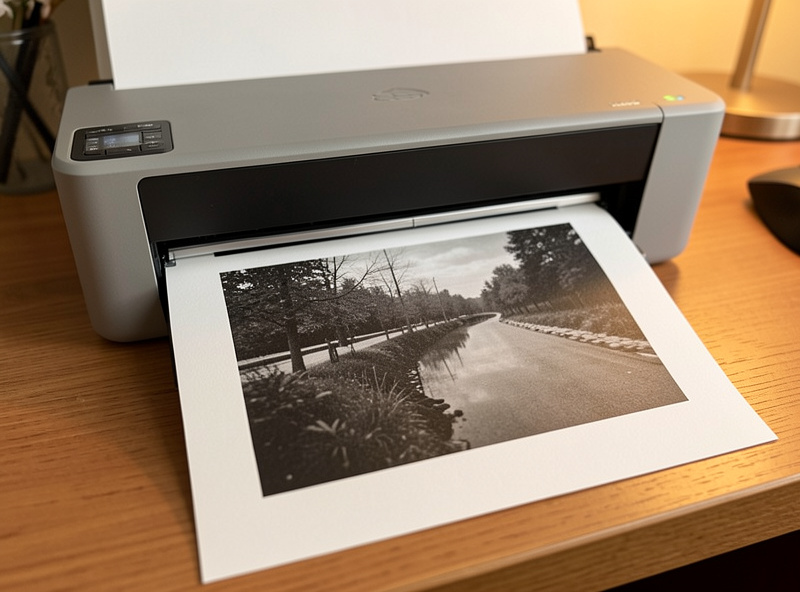
Print needs more sharpening than the web — often much more — and this surprises people the first time. Ink spreads slightly as it soaks into paper (dot gain), the printing process itself softens fine detail, and you’re viewing the result at a larger physical size and closer inspection distance than a thumbnail. So print output sharpening is deliberately more aggressive, with a larger radius, and it will look distinctly over-sharpened on your monitor — that’s expected and correct, because the paper and ink absorb the excess.
The amount also depends on the paper. Glossy and luster papers hold detail crisply and need less sharpening; matte and fine-art rag papers are thirstier and diffuse the ink more, so they need a heavier hand. My print recipe: export or print at the paper’s native resolution (300 or 360 DPI depending on the printer), with Lightroom’s output sharpening set to “Matte” or “Glossy” and “Standard” or “High” depending on the paper and how much fine detail the image carries. I make a small test print, judge it under good light, and adjust — because the only honest judge of print sharpening is a print. The full path from edit to framed wall print is in my photography printing guide, and the home-printer setup is in printing photos at home.
This is the single most common mistake, and it wrecks images in both directions. When you view a downsized web export at 100% on a high-resolution monitor, you’re looking at the image far larger than anyone ever will online — so it looks over-sharpened and haloed, you back the sharpening off, and the actual web-size image ends up soft. Conversely, judging a print file at 100% on screen makes it look crunchy, so you under-sharpen, and the print comes out flat. The monitor lies about output sharpening because it isn’t the output.
The rule: judge web sharpening at the actual export dimensions, viewed at the size it’ll appear, and judge print sharpening on an actual test print under good light. For screen work I’ll set the zoom to “Fit” or view the exported file at real size in a browser; for print, nothing substitutes for paper. My calibrated monitor gets the color and the capture-sharpening right, but output sharpening is a judgment about the destination medium, and the destination is where you have to look. Trusting the 100% view is how careful photographers ruin otherwise-perfect files.
Over-sharpening has clear tells once you know them. The classic is halos — bright or dark outlines along high-contrast edges, like a glow around a branch against the sky or a dark rim on a bright horizon. Next is crunchy, brittle texture, where fine detail looks etched and artificial rather than natural. Third is amplified noise: sharpening boosts contrast indiscriminately, so without masking it turns sensor grain in smooth areas into a gritty mess, worst of all in skies and shadows.
My own worst habit early on was a heavy global sharpen with no masking, which made my landscapes look electric — every rock edge glowing, the sky full of grain — and I thought it looked “sharp” until I printed one and saw the halos an arm’s length away. The lesson stuck: sharpening should be invisible. A well-sharpened image just looks crisp and natural; you should never be able to point to the sharpening itself. If you can see it, it’s too much. When a frame looks soft to begin with, though, sharpening can’t rescue it — that’s a capture problem, and my soft-photo diagnosis guide and aperture sweep method fix it at the source. Sharpening enhances real detail; it can’t invent detail that motion blur or missed focus destroyed.
Here’s where I land for the two main destinations, as a starting point you’ll refine to your own images and gear. These assume capture sharpening is already handled in develop and the file is resized to final dimensions.
| Destination | Size / resolution | Amount | Radius | Notes |
|---|---|---|---|---|
| Web / social | 2048 px long edge | Light (60–80) | 0.5–0.8 | sRGB; judge at export size, err lighter |
| High-res screen / 4K display | 3840 px long edge | Light-medium | 0.6–0.9 | Slightly more than small web |
| Glossy / luster print | 300–360 DPI | Medium (100–130) | 1.0–1.3 | Holds detail; less than matte |
| Matte / fine-art rag print | 300–360 DPI | Heavier (130–160) | 1.2–1.5 | Thirsty paper; will look strong on screen |
| Large print, distant viewing | 240–300 DPI | Heavier | 1.5+ | Bigger radius for viewing distance |
In Lightroom’s Export dialog most of this collapses to picking “Screen,” “Matte Paper,” or “Glossy Paper” with a Low/Standard/High amount — the presets are genuinely good starting points and handle the after-resize timing for you. For the develop-stage capture sharpening that precedes all of this, and the broader post-processing order of operations, my Lightroom develop workflow and full photo editing guide lay out where sharpening sits in the sequence.
Stop judging output sharpening on your editing monitor. Set up two export presets — one “Screen, Standard, 2048px” for web and one “Matte/Glossy, Standard, 300 DPI” for print — and use them every time so output sharpening becomes automatic rather than a fresh guess per image. Turn up masking so smooth areas stay clean. Make a test print before committing to a big one. And remember the ceiling: sharpening polishes detail that’s already there, so the real sharpness work happens in the field and at the aperture, not at the export slider. Get those right, add a medium-specific output sharpen at the end, and your images will look crisp everywhere they land.

Focus stacking merges several frames focused at different distances into one image where every plane…

To remove people from a scene with a long exposure, use a strong ND filter…

Image stabilization fights camera shake only — nothing else. IBIS floats the sensor to cancel…
Leave a Reply