Photographing Vinyl Records: Macro Lighting for Grooves, Labels, and Sleeve Art
Photographing a vinyl record properly requires a macro lens at f/8 to f/11 and raking…
Photography composition is the deliberate arrangement of elements within a frame to guide the viewer’s eye and convey intent. In my own experience judging club-level submissions and reviewing my own catalog year over year, composition is consistently the single biggest factor separating professional-feeling work from amateur captures — more than sharpness, more than exposure accuracy, more than the camera underneath it. I learned this the hard way — my early work was sharp and well-exposed but compositionally flat, and the difference between those frames and what I produce now on my Fujifilm X-T5 is not the camera — it’s the arrangement.
Composition is the visual grammar of photography. Without it, even a technically perfect image — sharp focus, correct exposure, ideal white balance — falls flat because nothing leads the viewer through the scene. With strong composition, a simple smartphone photo can outperform a $5,000 camera setup. The techniques below give you that control — but there is one rule I break more often than I follow, and knowing when to abandon it is what took my compositions from competent to compelling. I will point it out in section 10.
Understanding composition also pays off wherever images compete for attention — social feeds, stock platforms, print sales. A well-composed frame holds a viewer’s eye longer and reads clearly at a thumbnail size where a cluttered or dead-centered shot gets scrolled past, and buyers on stock platforms consistently favor images that guide the eye predictably over ones that don’t — a quality that depends entirely on composition, not camera resolution or lens sharpness. The Gestalt principles of visual perception — proximity, similarity, closure, continuity, and figure-ground — are the psychological foundation underlying every composition rule on this page; Rudolf Arnheim’s Art and Visual Perception remains the definitive text connecting these perceptual laws to photographic composition.
The rule of thirds divides your frame into a 3×3 grid with two horizontal and two vertical lines. Placing your subject on any intersection point — not dead center — creates natural tension and visual interest. It’s the single most common off-center placement pattern I see across award-winning and portfolio-grade work in every genre I shoot. On my X-T5, I keep the grid overlay permanently enabled — it costs nothing and has saved me from centering a subject out of habit more times than I can count.
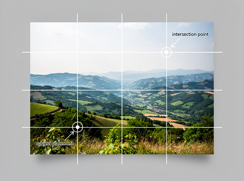
Most cameras and smartphones can overlay a rule-of-thirds grid on the screen. Enable it and use it as a starting framework. Place horizons on the upper or lower horizontal line rather than splitting the frame. Position a person’s eyes on the upper-third intersection when shooting portraits. This simple shift immediately adds professionalism to your images.
The rule of thirds is not law — it is a training wheel. Once you internalize why off-center placement works, you will start placing subjects at varying distances from center depending on the story you want to tell. A subject slightly off-center feels different from one pushed to the far edge, and both choices carry meaning.
The rule of thirds applies differently across genres. In landscape photography, the grid lines typically hold the horizon and a key terrain feature. In portrait photography, the subject’s eyes align with the upper horizontal line and their body follows one of the vertical lines — this is where lens rendering and bokeh quality matter most because the background falls where the viewer’s eye naturally drifts next. In street photography, the intersection points mark where the most dynamic human gesture or expression should land. Adapting the grid to each genre — rather than applying it mechanically — is what separates intermediate photographers from beginners.
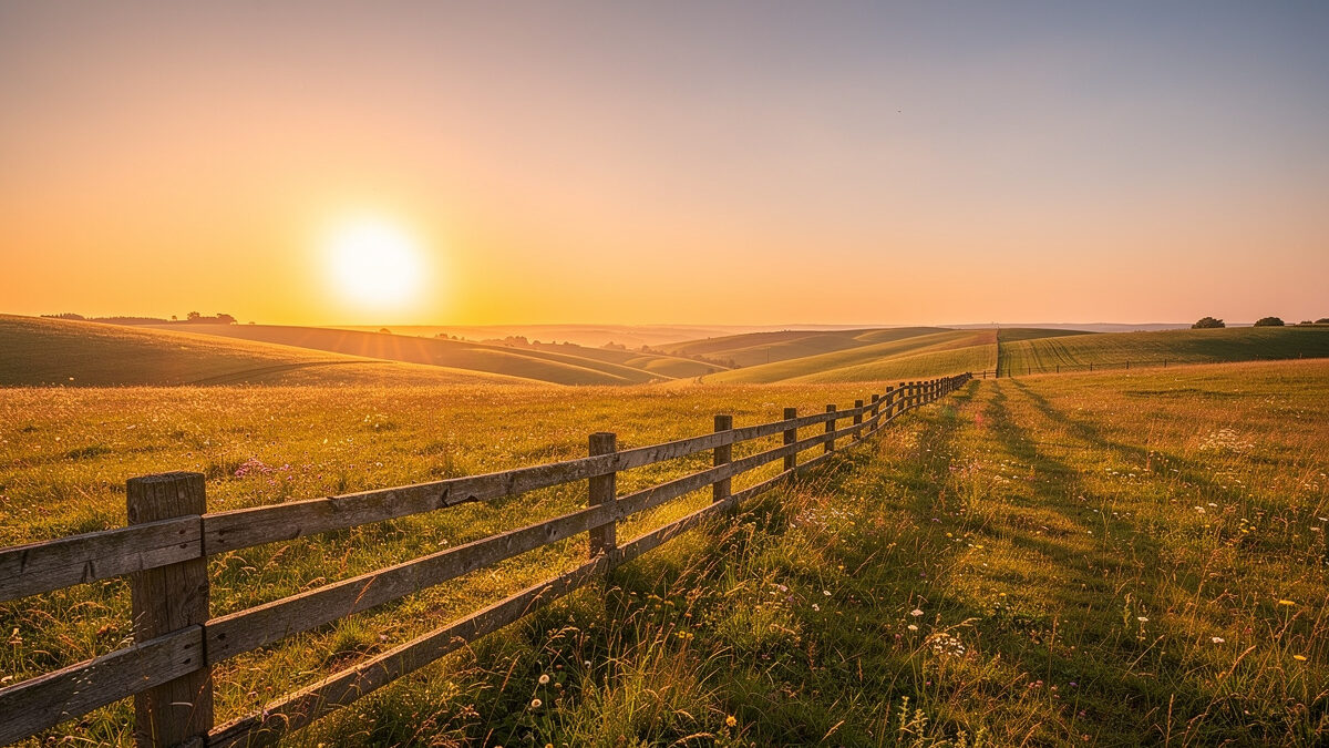
Leading lines are natural or architectural elements — roads, fences, rivers, shadows, railings — that draw the viewer’s eye from the foreground toward the main subject or through the entire frame. They create depth, establish a visual path, and make flat images feel three-dimensional. With my XF 16-55mm f/2.8 at the wide end, I hunt for converging lines — the added depth a 16mm perspective pulls into a frame is the single fastest way to transform a flat scene into something the viewer steps into.
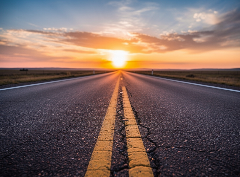
Look for lines in every scene you photograph. A winding road through a valley, the edge of a sidewalk receding into the distance, or the pattern of floor tiles all serve as leading lines. Diagonal lines add dynamic energy. Curved lines feel graceful and organic. Converging lines create powerful vanishing points that pull the viewer deep into the image.
The most effective leading lines start at the bottom corners of the frame and move inward or upward. Lines that originate from the frame edge and terminate near the subject give the viewer a clear visual roadmap. Avoid lines that lead out of the frame — they work against your composition.
Implied leading lines work just as effectively as physical ones. A row of streetlights creates a dotted leading line. A sequence of people walking in the same direction implies movement and path. Even eye direction — where a subject in the frame is looking — acts as an invisible leading line that pulls the viewer toward the area of interest. This principle is why busy backgrounds kill portraits — they create competing implied lines that pull the eye away from the face. Train yourself to see lines in shadows, reflections, light beams, and human gestures, not just physical objects.
The golden ratio (approximately 1.618:1) is a mathematical proportion found in nature — shells, flowers, galaxies — that humans instinctively find aesthetically pleasing. In photography, the golden spiral places the focal point at the smallest point of a logarithmic spiral that sweeps across the frame, with supporting elements falling along the curve.
While more complex than the rule of thirds, the golden ratio produces compositions that feel balanced without being symmetric. Place your main subject where the spiral tightens, and let secondary elements — a winding river, a curving path, the sweep of a model’s arm — follow the spiral outward. This technique is particularly effective in landscape and architectural photography — it is the same proportional logic that makes the Helios 44-2’s spinning bokeh feel organic rather than disorienting; the swirl follows a natural curve the eye accepts without effort.
You do not need to draw the golden spiral mentally every time. Instead, compose with the rule of thirds and then shift your subject slightly toward the spiral’s convergence point. Over time, this placement becomes intuitive, and your compositions will naturally reflect the proportions that the human eye finds most satisfying. Michael Freeman, in The Photographer’s Eye, documents exactly this progression — the transition from mechanical grid application to instinctive proportion placement is the hallmark of a photographer who has internalized composition rather than memorized it. If you are shooting on vintage glass adapted to a mirrorless body, the manual-focus workflow also gives you more time to study the frame — adapting vintage lenses slows you down in a way that benefits composition.
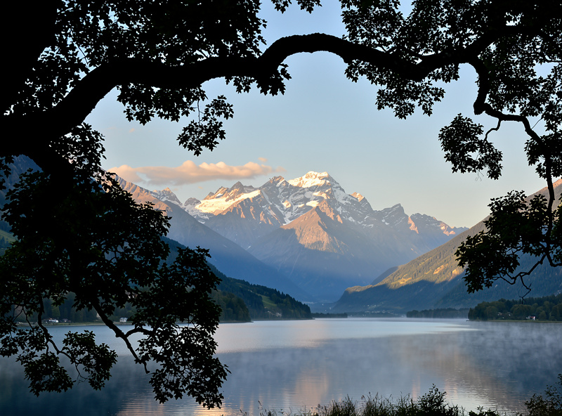
Framing means using foreground elements — doorways, windows, tree branches, arches, hands — to create a border around your subject. This technique adds depth, directs attention, and gives the viewer a sense of peering into a scene from a specific vantage point.
Walk around your subject and look for natural frames. A gap between two trees, a window in a stone wall, or even your own hands held up to form a rectangle can work. The frame does not need to be complete — a partial frame on two or three sides is often more effective than a full border, which can feel restrictive.
Frames work best when they are slightly darker or less detailed than the subject they surround. A dark doorway framing a sunlit street creates natural contrast. I use this principle constantly when shooting through the gaps in my camera bag or car window — the out-of-focus foreground frame adds a layer of depth that no amount of post-processing can fake. Avoid frames that are brighter or more visually complex than your subject, as they compete for attention rather than enhancing it.
Environmental framing extends to natural elements — overhanging tree branches, cave entrances, bridge underpasses, and tunnel openings all create organic frames that add context about the location. The strongest travel photographs use environmental framing to establish a sense of place — the viewer understands where the photographer stood and what they saw through, not just what they photographed. This spatial context is what separates a travel image from a generic landscape. The travel photography composition guide takes these environmental framing principles into the specific situations you hit on the road — crowded markets, iconic landmarks with no clean foreground, and the variable light you cannot plan for.
Symmetrical compositions — where both halves mirror each other — create a sense of harmony, stability, and formality. Think of a lake reflecting a mountain, a row of columns in a cathedral, or a face centered perfectly in the frame. Symmetry feels satisfying because it mirrors how we perceive balance in the physical world.
Patterns are repeating elements — tiles, windows, flowers, faces in a crowd — that create visual rhythm. Breaking a pattern (a single red apple in a row of green ones) immediately draws the eye to the disruption, making it a powerful compositional tool for emphasizing a focal point within an otherwise uniform scene.
Combine symmetry with a broken pattern for maximum impact. A perfectly symmetrical corridor with one door open becomes a narrative — the viewer asks why that door is open. I once shot a row of identical windows on an old brick facade in Gamla Stan; the single broken pane three-quarters down the row, catching the afternoon light at a sharper angle than the rest, turned an architectural record shot into something people paused on for ten seconds. The cat’s-eye bokeh at the frame edge is another example — the asymmetry of those flattened highlights against a symmetrical composition creates a tension that symmetry alone cannot deliver.
Negative space is the intentionally empty area surrounding your subject — a vast sky above a lone tree, a blank wall behind a person, or an open ocean around a single boat. It isolates the subject, creates breathing room, and conveys mood, loneliness, or serenity depending on context.
The ratio of negative space to subject is the key decision. A subject occupying only 10-15% of the frame with the rest empty creates a contemplative, minimal feel. A 40-50% ratio feels balanced. Below that, you lose the negative space effect and the image starts feeling cluttered. There is no single correct ratio — match it to the emotion you want to evoke.
Negative space does not need to be completely empty. A gradient sky, a textured wall, or a shallow depth-of-field blur all work as negative space. The key is that these areas contain no competing points of interest. They support the subject without distracting from it. This is also where specular highlights shaped into bokeh balls earn their keep — a single pinpoint of light in an expanse of dark negative space carries more compositional weight than a dozen bright elements fighting for attention.
Composing with distinct foreground, middle ground, and background layers transforms flat images into dimensional scenes. A flower in the foreground leading to a meadow leading to mountains creates visual depth that a single-layer image cannot match.
Use a wide aperture (f/2.8 or wider) to blur the foreground or background, isolating a sharp middle layer. My XF 56mm f/1.2 wide open drops backgrounds into a buttery wash — nothing isolates a subject faster. Alternatively, use a narrow aperture (f/11-f/16) to keep all layers sharp for landscape work. The choice depends on the story — blur suggests intimacy or focus, while sharp layers convey vastness and detail. Photographers who want more subject separation but cannot afford an f/1.2 prime should learn how to get more background blur without a faster lens — subject-to-background distance often matters more than aperture.
Look for “frame within a frame” layering: a sharp subject through a blurry foreground element (shooting through leaves, fence gaps, or curtains) creates a voyeuristic quality that draws viewers in. This technique is used heavily in wedding, wildlife, and street photography for its ability to create atmosphere.
Layering also applies to light and shadow. A scene with a bright background, mid-tone middle ground, and dark foreground creates natural tonal layers that add three-dimensionality without any compositional elements. I notice this most on foggy mornings — the mist softens distant trees into pale silhouettes while foreground branches stay sharp and dark, and the compressed tonal range makes the photograph feel physical, like you could step from the dark foreground into the light midground. Converting such images to black and white amplifies this tonal layering effect, making the dimensional separation even more dramatic and impactful.
Colors carry emotional weight and compositional power. Warm tones (red, orange, yellow) advance toward the viewer and feel energetic. Cool tones (blue, green, purple) recede and feel calm. Placing a warm subject against a cool background — or vice versa — creates natural visual separation without any post-processing.
Complementary colors (opposite on the color wheel: blue/orange, red/green, yellow/purple) create maximum contrast and visual pop. Analogous colors (next to each other: blue/green, orange/yellow) create harmony and flow. Use complementary pairs for dynamic, attention-grabbing compositions and analogous schemes for serene, unified images.
Color dominance determines the overall mood. A frame dominated by cool blue tones with a small warm accent feels peaceful with a focal point of energy — I think of the long Swedish blue hour in June, that deep cobalt sky holding a single warm-lit window that feels like a promise. A warm-dominant frame feels lively and inviting. Pay attention to color distribution as carefully as you place physical elements. A circular polarizer is the most underrated color-composition tool in the bag — it saturates skies and cuts reflections, effectively boosting the cool-warm contrast without touching a slider in Lightroom.
Monochromatic color schemes — variations of a single hue — create sophisticated, cohesive compositions. A scene built entirely from blues (navy shadows, sky-blue midtones, pale blue highlights) feels unified and intentional. This approach works exceptionally well in minimalist and fine art photography where restraint communicates artistic control. It is also why black-and-white conversions hold up — stripping color forces the viewer to read composition, light, and texture. Lens filters can help you lean into a color scheme in-camera rather than chasing it in post. Limiting your palette to two or three colors per image prevents the visual noise that comes from including every color in the scene.
Every rule above exists to serve a purpose. Breaking them intentionally — and knowing why you are breaking them — produces some of the most powerful images. A centered subject can feel confrontational and powerful. A tilted horizon creates tension and unease. A cluttered frame conveys chaos and energy.
The difference between a beginner who ignores composition and an advanced photographer who breaks rules is intention. Before you center a subject, ask yourself what emotional effect the symmetry creates. Before you tilt the camera, identify the tension you want to convey. Rules-breaking without purpose is just sloppy technique.
Study photographers known for rule-breaking — Saul Leiter’s abstract color fields, Daido Moriyama’s chaotic high-contrast street shots, Henri Cartier-Bresson’s precise geometries built on decades of Leica work and the “decisive moment” philosophy that came to define street photography. Notice that their “broken” rules still follow deeper principles of balance, tension, and visual hierarchy. They mastered the rules first, then transcended them.
One practical way to practice intentional rule-breaking is the “wrong settings” exercise: deliberately center every subject for a full day, or tilt every horizon by 15 degrees, or fill the frame completely with zero negative space. I tried the centered-subjects-only exercise for a week with my XF 35mm f/1.4, and the first three days were genuinely humbling — photos I thought would feel powerful just looked boring, and I had to shoot nearly 400 frames before I learned when centering works (strong symmetry, direct eye contact, one dominant subject) and when it fails (any scene with two competing points of interest). By forcing yourself to violate one rule consistently, you discover what emotional effect each rule creates — and when violating it actually serves the image better than following it. This experimentation phase is where photographic style begins to develop.
The following table ranks ten composition techniques by their difficulty to master, versatility across genres, and the immediate visual impact they produce. Beginners should start at the top; experienced photographers should explore the lower entries for fresh creative approaches.
| Rank | Technique | Difficulty | Best Genres | Impact Level |
|---|---|---|---|---|
| 1 | Rule of Thirds | Beginner | All genres | High — instant improvement |
| 2 | Leading Lines | Beginner | Landscape, architecture, street | High — adds depth immediately |
| 3 | Negative Space | Beginner-Intermediate | Portrait, wildlife, minimalist | High — dramatic mood shift |
| 4 | Framing | Intermediate | Portrait, travel, street | Medium-High — adds context |
| 5 | Symmetry and Patterns | Intermediate | Architecture, nature, abstract | Medium-High — strong visual impact |
| 6 | Depth Layering | Intermediate | Landscape, portrait, wildlife | Medium — transforms flat images |
| 7 | Color Theory | Intermediate-Advanced | All genres | Medium — subtle but powerful |
| 8 | Golden Ratio | Advanced | Landscape, fine art, portrait | Medium — refined balance |
| 9 | Diagonal Composition | Intermediate | Sports, street, abstract | Medium — adds dynamic energy |
| 10 | Rule-Breaking (Intentional) | Advanced | All genres | Variable — depends on execution |
Diagonal lines carry more visual energy than horizontal or vertical ones because they imply motion and instability — the eye reads a diagonal as something caught mid-transition rather than at rest. A staircase shot straight-on feels static; the same staircase shot from a corner, its steps cutting across the frame at an angle, feels like it’s climbing somewhere. This is the technique I reach for most in street photography, where I want the frame to feel like a moment sliced out of movement rather than a posed tableau.
The easiest way to introduce a diagonal is to tilt your shooting angle relative to a naturally horizontal or vertical subject — a fence line, a row of windows, a shoreline. A 10-15 degree tilt is usually enough to read as intentional dynamic composition rather than an accidental crooked horizon; anything beyond 20-25 degrees starts reading as disorientation rather than energy, unless disorientation is exactly the mood you’re chasing. Sports and action photography leans on diagonals constantly — a sprinter’s body, a skier’s line down a slope, a cyclist banking through a turn all naturally create diagonal energy that a level, square-on frame would flatten.
Diagonals also work in combination with leading lines and the rule of thirds — a diagonal leading line from one corner to an off-center subject on a thirds intersection is one of the most reliable dynamic compositions across every genre I shoot. On my X-T5, I actively hunt for existing diagonals in architecture and landscape scenes — a receding fence line, a sloped roof, a river bend — before I ever consider tilting the camera itself, because a genuine diagonal in the scene reads as more intentional than an artificially tilted horizon. The one place I’d warn a beginner off diagonals entirely is architecture where verticals need to stay true — a tilted building reads as a mistake, not energy, and that’s exactly the scenario where a level horizon and a straight vertical earn their keep over any dynamic trick.
Before pressing the shutter, run through this five-step mental checklist. It takes three seconds and transforms reactive shooting into deliberate image-making.
First, identify your subject — what is this photo about? Second, decide where to place it in the frame (off-center, framed, centered for symmetry). Third, check the edges — is anything entering the frame that should not be there? Fourth, look for supporting elements — leading lines, patterns, color accents. Fifth, ask whether every element earns its place or should be removed by reframing.
This checklist works for every genre and every skill level. Over weeks of practice, these checks become automatic, and you will start composing intuitively the same way experienced musicians play without reading sheet music. The techniques become internalized patterns that guide your eye before you consciously think about them — and at that point you’ll notice yourself framing a shot correctly before you’ve consciously named which rule you’re applying, which is the actual goal of all of this. The rules are scaffolding, not the finished building.
A useful exercise is the “one technique per day” challenge. On Monday, shoot everything using only the rule of thirds. On Tuesday, look exclusively for leading lines. Wednesday, frame every shot through a natural element. By cycling through techniques daily for two weeks, you internalize each one individually before combining them freely. Professional photographers develop this muscle memory through years of deliberate practice — this structured approach accelerates the process from years to months.
Composition also extends to post-processing. Cropping in Lightroom Classic on my calibrated monitor is a compositional decision — I am reframing the image after capture. Use the crop overlay tool with the golden ratio or rule-of-thirds grid enabled to refine your compositions during editing. Many photographers improve their compositions more in post-processing than in-camera because they can take time to evaluate the visual balance without the pressure of a live scene.
If I could give my younger self one piece of composition advice, it would be this: master the rule of thirds and leading lines first, shoot deliberately with those two tools for six months, and ignore every other technique on this page until those two feel automatic. Everything else — golden ratio, color theory, depth layering — builds on the foundation those first two techniques create. Trying to apply all ten at once produces stiff, overthought images. Applying two instinctively produces work that looks effortless. The long exposure techniques I use for seascapes and architecture are compositional tools in their own right — they simplify the frame by removing transient detail, which forces the viewer to read the remaining shapes, lines, and light. That is the through-line of every technique above: composition is not about adding more to the frame — it is about removing everything that does not belong. Every tool on this page, from the grid overlay to the golden spiral to the decision to break every rule at once, serves that single job.
The rule of thirds is the most impactful composition rule for beginners. Placing subjects on the grid intersections instead of dead center creates immediate visual interest and is the most common off-center placement pattern seen across award-winning and portfolio-grade photography.
Master three techniques before adding more: rule of thirds, leading lines, and negative space. These three cover 80% of everyday shooting scenarios across portrait, landscape, and street photography. Add framing and depth layering as your fourth and fifth.
Yes, but only intentionally. A centered subject creates confrontational power. A tilted horizon adds tension. The difference between rule-breaking and poor technique is knowing the emotional effect your choice creates before pressing the shutter.
A well-composed smartphone photo consistently outperforms a poorly composed photo from a $5,000 camera. Composition is the biggest single factor separating professional-feeling images from technically-correct-but-flat ones. Invest in learning composition before upgrading gear.
Negative space is the intentionally empty area around your subject — a vast sky, blank wall, or open water. It isolates the subject and creates mood. A subject occupying only 10-15% of the frame produces a contemplative, minimal aesthetic.
Use your phone with the grid overlay enabled. Shoot 10 photos daily, each applying a different technique — rule of thirds, leading lines, framing, symmetry, negative space. Review each image and identify which technique you applied. Consistency beats intensity.
Continue building your photography foundation with these guides:

Photographing a vinyl record properly requires a macro lens at f/8 to f/11 and raking…

Macro photography captures subjects at 1:1 magnification or greater, filling the camera frame with objects…

This wildlife photography beginner guide starts with the foundation every new shooter needs: the right…
Leave a Reply